Graph 2: Price vs Rating
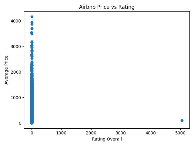
This scatter plot shows the relationship between Airbnb ratings and average price after removing invalid and missing values from the dataset. The points are still spread out, but a general pattern can be seen where higher-rated listings tend to have slightly higher prices. However, the relationship is not perfectly strong, meaning that rating alone does not fully determine price. Other factors such as location, size, and amenities likely have a bigger impact on pricing.
Graph 3: Price vs Latitude
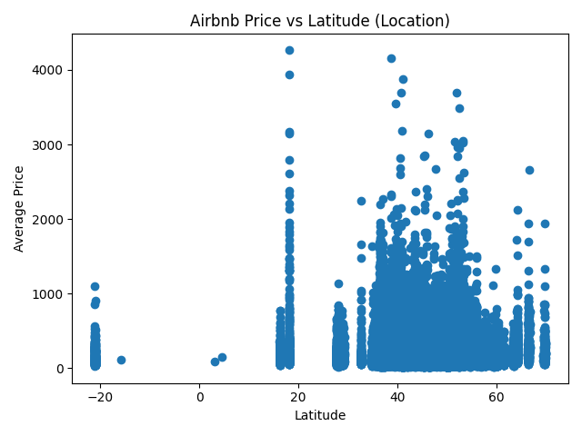
This graph compares Airbnb price with latitude (location on Earth). Latitude values can be negative or positive depending on geography. Prices vary widely, but location still plays a role in how much listings cost across different regions.